Having a website is mandatory, regardless of the business you run. However, having a website doesn’t end there. That’s just the beginning.
If you want your visitors to visit your website, see what you’re selling, and potentially buy something from you, you must keep them engaged. Make it easy for them so they’ll enjoy spending time on your website.
The ultimate goal is to convert potential customers into paying customers. You can accomplish this with enough time and effort.
Let’s dig into some website navigation best practices that will make users return to your website time and again.
Why Website Navigation Matters
User-friendly websites tend to keep their visitors and reap the benefits.
On another note, websites can suffer from issues like slow loading time, wrong navigation structure, and unintuitive menus. All this will result in a high bounce rate. You don’t want that, trust me.
How can you achieve all this greatness? What should you do to improve your website navigation menu?
Don’t sweat. We’ll go through it all.
Best Practices for Designing Intuitive Menus
What is effective navigation, and why is it so important? It’s simple if you think about it. Website navigation helps guide visitors through the website. Besides, it allows users to quickly burrow through tons of information with a seamless experience.
Sounds impressive, right?
This is where it becomes interesting. The more time people spend on your website, the better.
Why? This means you’ll have a much better chance of using calls to action and boosting conversion rates. This means you’ll convert visitors into paying customers. In addition, you’ll reduce the bounce rate. Clutch’s study discovered that 94% of visitors prefer easy, intuitive, and positive experiences.
What can you do to design the best user-friendly primary navigation menu? You can do a lot, but let’s start with the basic navigation practices.
Keep It Simple and Consistent
Like with most things in life, simplicity is the key. When designing a website navigation, you should consider making it fast, accessible, and easy to use.
Putting many options in your navigation bar may confuse users and make it harder for them to navigate. So, please keep it to the minimum, put the things that need to be there, and don’t overthink things. The important thing for users is to find what they need, not to see your web design skills.
In addition, ensure your navigation bar is consistent throughout. Why is consistency so important? It makes the website fast and easy to use, lowers OCD stress levels, and looks neat.
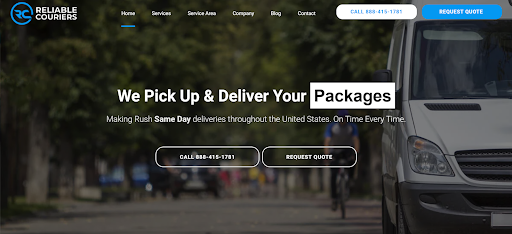
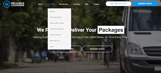
Let’s take a look at Reliable Couriers’ website. It is simple and easy to understand, and the menu items are organised in hierarchical order according to their importance.

Then, except for the “Home” item, when selecting one of the items, a new menu displays showing more items.

Use Descriptive Labels
The next thing to do to achieve greatness is to use descriptive labels. Menu labels should be concise and offer precise information so users can quickly roam through the pages. As much as you’d love to use simple language like jargon or out-of-this-world labels – don’t!
Why not? Well, none of it will help your cause. In fact, it may only bring more confusion. Do as I say, not as I do.
Implement a Search Function
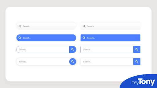
Even though great navigation designs can help a ton, having a search box or search bar on your site makes a lot of difference. If you’re like me, looking for a search bar is the first thing you probably do when visiting a new site.
It’s only logical as there’s no better or faster way to find the necessary information. Around 43% of people look for the search bar when visiting a new site. I belong in that half. And you?

Prioritise Mobile Navigation
Mobile devices aren’t new. They’ve been around for many years. Accessing websites through a mobile device is a whole other beast in itself. Today, 58.99% of global website traffic comes from mobile devices.
Mobile-friendly sites are different from regular ones. Screens are smaller, menus are different, and sites often look different than their original counterparts.
In addition, mobile sites often use mobile menus like sticky menus that hover at the top of the screen regardless of whether you’re scrolling through the page.
Nevertheless, it’s vital to optimise your website for mobile device browsing as well.
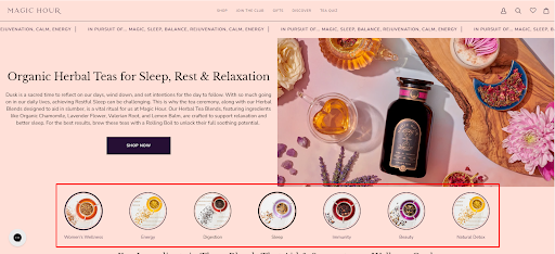
Magic Hour’s teas for sleep page is an excellent example of how you can play with your menu structure. Horizontal menus are usually placed at the top of a page, but you can play with that and include another one right in the middle to make the page more attractive. This is especially useful when the items in this menu belong to the same category: types of tea benefits, in this case.

Use Breadcrumbs for Secondary Navigation
When it comes to website navigation, breadcrumbs serve as an alternative. You can usually find them at the top of the page, showing users the path they’re currently on within the site.
Breadcrumbs are super-useful for sites with extended hierarchies and lots of content. This navigational alternative helps users find their way back easily.
In addition, breadcrumbs are helpful when adding contextual links to your site. These will help improve your SEO efforts. Sounds incredible, right?
Optimise for Accessibility
When optimising your site, you must consider everything and everyone. If someone with a physical disability visits your site, it may be impossible to navigate. To avoid this, you should implement large, readable fonts and menus they can access without using a mouse or a trackpad.
Using tools like text-to-speech is convenient for different groups of people. People with sight impairments or those preferring to work on other tasks while listening to content instead of reading can benefit from this feature.
Accessibility optimisation doesn’t end here, and you should use different accessibility features for various categories of potential users.
Conclusion
As we said, having a website is just the starting point. What comes after are things that will either make your site great or… not so much. Focus on an intuitive menu, accessibility, ease of use, and user satisfaction. These strategies will help reduce bounce rates and improve user experience.
Author bio
Guillaume is a digital marketer focused on handling the outreach strategy at uSERP and content management at Wordable. Outside of work, he enjoys his expat life in sunny Mexico, reading books, wandering around, and catching the latest shows on TV.


