Your website is one of your most important brand assets. You can get your whole branding strategy right with a beautiful logo in place but if your web design is poorly executed your visitors will notice. This article will look at five well-known businesses that elevated their branding even further with very effective website design. There are lessons to be drawn from reviewing these beautiful examples that you can then apply to your own website project. Whether you are just launching your website or going through a redesign make sure you execute your design and user experience just as well.
Headspace

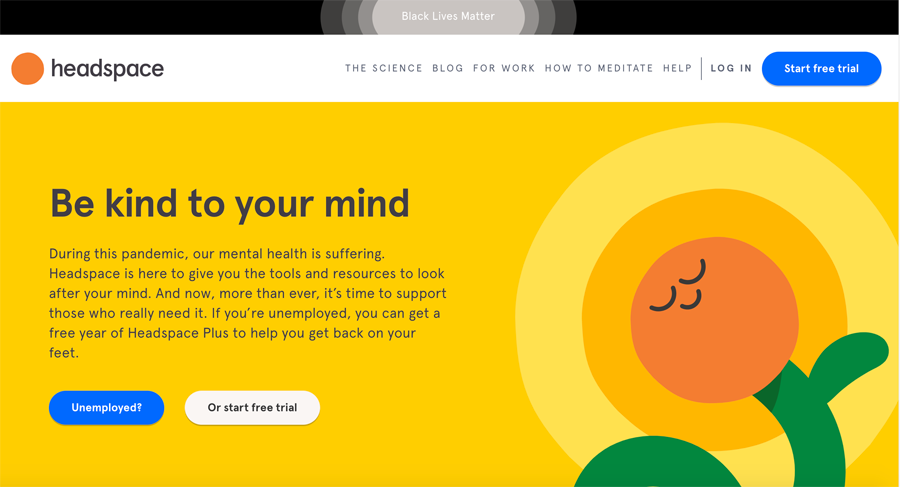
Headspace has gained a lot of traction recently. Their popular meditation apps are used around the world and their branding is starting to get recognised more and more. Their home page is a great example of utilising colour to communicate the right brand message visually. Their yellow and orange colour palette instantly communicates calm and enlightenment. Whenever you can communicate what your business does without using words that’s a branding win.
Dropbox

Dropbox uses a very clean and results driven design approach. Their goal is to get users to sign up, building their home page around that is a smart choice. Their business model of sharing files drives their promotional strategy. Most first time visitors to Dropbox are referred by a friend. When they visit the site they simply want to register so they can access the file that was shared. Putting UX over fancy design is a clever branding choice in this case.
Monday

One second on Monday’s website will be enough to know exactly what they are about. They keep their design clean, using lots of white space so they can communicate their message effectively. Similar to Dropbox they put a lot of focus on call to actions. Their logo is also a great example of effective branding. Logo 101 suggests using simple graphics and colour patterns to create an easy to remember brand. Their graphic is very abstract yet uses colour very effectively. A logo like this can be scaled to any size and still look good. Note, how the website design uses subtle accent colours across that are drawn from the logo.
Zilllow

This real estate listing giant is another example of a business making the most of their website and web presence. All of their branding is incredibly consistent across all of their promotional and informational items such as their social media channels, business cards, presentations, etc.. Their branding is built on a simple yet effective logo. Concerned with turning visitors into users instantly their home page asks you to enter an address or zip code to show you appropriate real estate listings.
AirBNB

The Airbnb brand has gotten very well known over the last few years. Their incredible growth is in part due to their efficient promotional and branding strategy. Their website is visually pleasing but also built with purpose. Visitors are instantly encouraged to engage by searching for a vacation rental. Marrying design and interaction well is a great recipe for successful conversions. Airbnb changes their backdrop image or illustration on the home page quite frequently to add a nice visual touch but their branding colours are always consistent.
What Can We Learn From These Examples?
All of the companies listed here have tremendous recourse behind them and they can work with the most skilled brand strategists and designers. A few branding tips apply no matter the size of your business or budget however. Whether you are designing a website from scratch or going through a redesign be consistent. Your design project should start with your logo. The colour will then inform all of your colour choices across your website.
Another lesson learned is to put intent first and give the user what they are looking for instantly. A beautiful illustration might be visually pleasing but don’t prioritisation that over user engagement like prominent call to action forms and fields.
You’ll also notice that all of these website designs are very deliberate in colour choice. As the Headspace example illustrates, different colours evoke different emotions. When you choose your brand colour during the logo process try to factor this in and make a choice that aligns with your business mission.


